4 minutes
When I see the Coca-Cola logo, I can hear ‘Holidays are coming’. And when I see those golden arches, I can taste chicken nuggets. I don’t even need to mention the brand name. You all know who I mean.
Of course these brands are synonymous with our day-to-day lives, but they really illustrate how important branding is for recognisability and, in time, brand trust. Carving out a niche, standing out in a crowd, building a loyal customer base – it’s what every organisation desires, and great branding can help this happen.
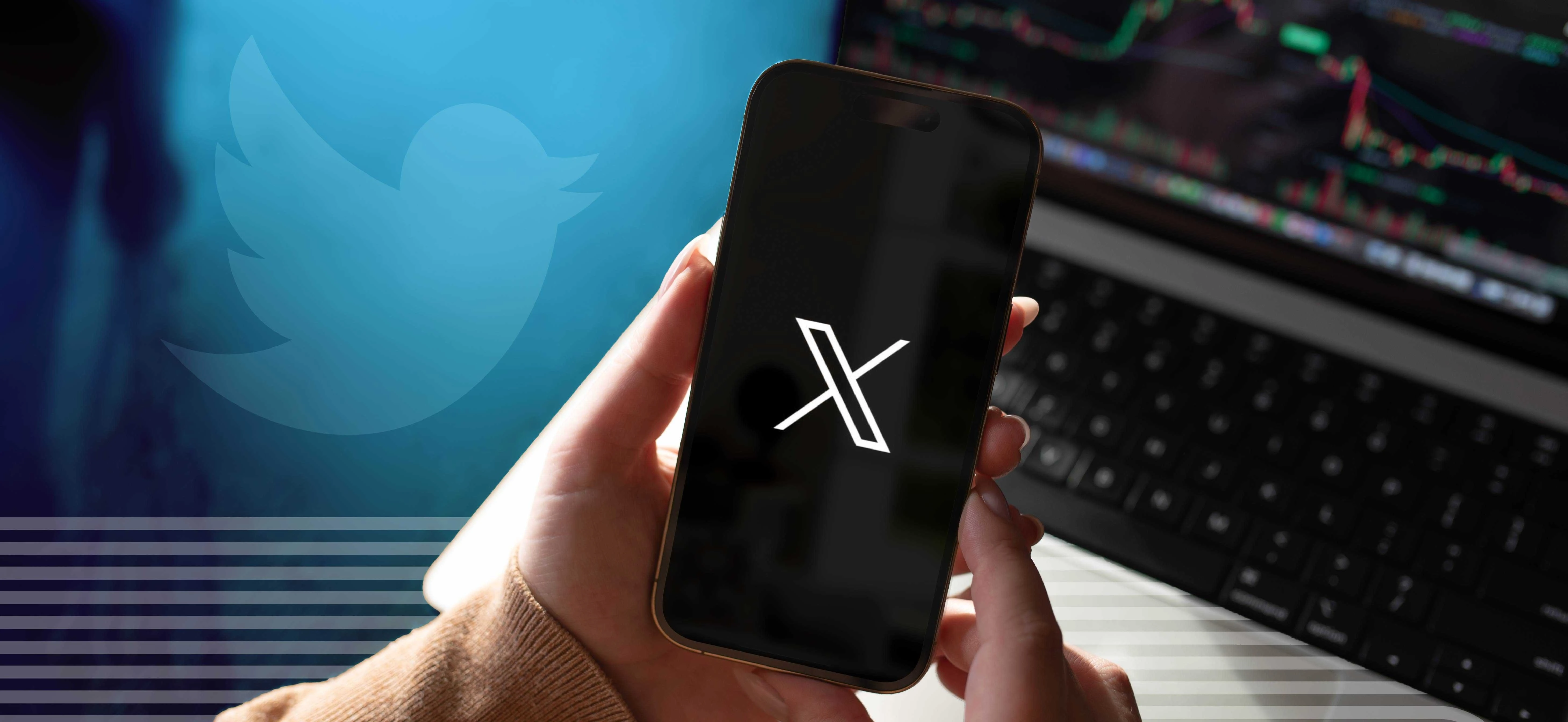
This week Elon Musk announced another big change at Twitter – the very foundations of Twitter itself received a sledgehammer blow, as the social media network became ‘X’.
With a hastily rolled out temporary logo, and half the site’s features still branded in the famous bright blue, it appears almost as if a mistake has been made with the new ‘X at the top of the page, where the famous bluebird once perched.
There’s still a ‘Tweet’ button, the ‘Home’ logo is still a bird house. No one even knows what a Tweet is going to be called when it’s no longer a Tweet. By all accounts, the rebrand has not been a success.
So why do businesses decide to rebrand? And what makes for a great rebrand… and what makes for an underwhelming (and even disastrous) one?
Businesses change, as does the aesthetics of design over time. Sometimes a change in direction can be demarcated by a change in branding, sometimes it’s just about refreshing your current look to something that feels a bit more forward facing. Afterall, you want your business to be perceived as at the forefront of new developments, even if your brand is very established.
Sometimes it’s just a tweak here and there, sometimes it’s a complete new look – but one thing we’d recommend brands not to do – as Twitter seems to have here – is to throw the baby out with the bathwater.
One example of this is Consignia. Remember this? I wouldn’t blame you if you didn’t. Royal Mail was Consignia for about a year before returning to Royal Mail. Royal Mail is a great brand, it has heritage, it’s recognisable. Consignia just didn’t mean anything to the British public. It didn’t resonate. I feel this is how the Twitter re-brand is being perceived by users.
Because rebranding isn’t just about a physical new look. It’s about changing hearts and minds.
On announcing the changes, Linda Yaccarino, CEO of Twitter, said: “X is the future state of unlimited interactivity – centered in audio, video, messaging, payments/banking – creating a global marketplace for ideas, goods, services, and opportunities. Powered by AI, X will connect us all in ways we’re just beginning to imagine.”
These are big ambitions, probably worthy of a rebrand. Quite how these pan out in time is anyone’s guess – it could be a genius move, after all. But Twitter’s instantly recognisable bliuebird logo hasn’t changed one bit in the last 12 years, which speaks volumes in itself as to how well the social media network’s branding was performing.
Considerations for organisations looking to rebrand:
- Think about why you are doing it, what you have to gain – and to lose
- Is it about a freshen up, or are you ready to make a statement with a bold rebrand
- What do you want your branding to say about who you are – and where you are heading
- How can a rebrand support your business goals – and help communicate them
- Never underestimate how strong customers’ emotional ties to your branding might be
If you’re considering a rebrand, a freshen up of your business’s branding or marketing materials, or would like support on any branding or marketing subject, don’t hesitate to get in touch with the Bluestorm team.
